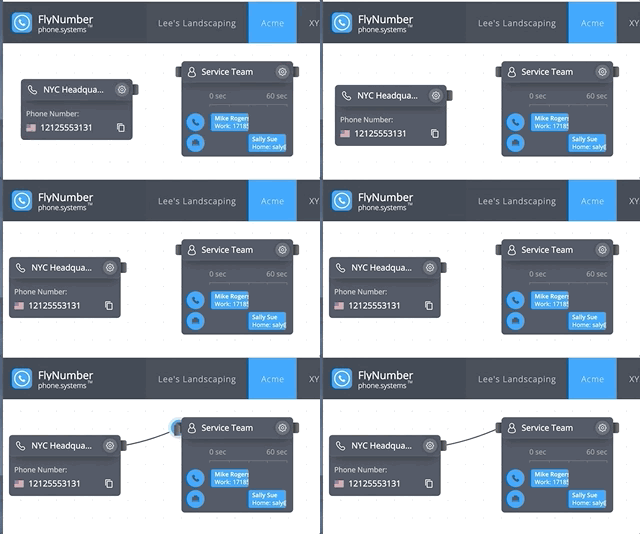
A digital grid to make configuring your call flow effortless
Remember those sheets of grid paper they used to hand out in elementary school, the ones you'd use for geometry or to draw graphs. Well, they've found their way to the digital world and our cloud phone system is one of them.

The Evolution of Our Grid Interface
I personally was always attracted to grids, so anytime I got to use them, for example- in school or other places, I was always delighted. Then, around 2012 we released the first version of the phone system, it had a true grid canvas while right now it's technically a "dot grid".
Why a Visual Grid Makes Sense
The fluidity of the grid and how it connects with modules will put your mind at ease when setting up your call logic (Sometimes a scary and daunting task). Whether you're a company with 15 agents or an entrepreneur just setting up a new business - your call logic will differ.
Could you imagine trying to set all this up with drop down menus, and check boxes?
-Nader Jaber
So instead of thinking of all the settings a business or user may want, the engineers instead built customizable modules that can be moved around anywhere on an open canvas. Everything is connected with flexible cables, making it intuitive and visual.
Building Blocks of Your Phone System
The system uses modules as building blocks, each serving a specific function:
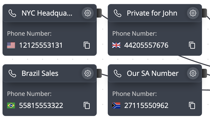
- Phone Numbers for incoming calls
- Ring Groups for team distribution
- Voicemail for message handling
- IVR (Interactive Voice Response) for automated menus
- Time Conditions for schedule-based routing
- And many more specialized modules

The Creative Canvas
The grid itself invites creativity - you open up your panel and the first thing you see is a nice, clean, fresh grid ready for creating. The changes are live, meaning if you attach your Brazil number [module] to the voicemail module- it will work right away. You may also find yourself making more and more customizations as time goes on, especially since new features are being added constantly. Who would have thought you'd want to route calls based on an area code? Check out our guide on area code routing to learn how to set up region-based call handling.
Flexibility in Organization
Many users know exactly what they're doing - they set up their call flow and forget it. If they need to make any changes they can do it anytime on any device. The system supports multiple ways to organize your call routing:
- Call Flows: Create separate instances for different departments or business units
- Workspaces: Organize related modules within each Call Flow
- Real-time Updates: Changes take effect immediately without needing to save or deploy

Universal Access
The system is designed for maximum accessibility:
Web Interface
The grid-based configuration interface works right in your browser - no special software needed. Access it from any device with a modern web browser, whether you're on a smartphone, tablet, or desktop computer. It's built with HTML5, ensuring broad compatibility and smooth performance.
Phone System App
We now offer a dedicated phone system app that makes managing your calls even easier. Available for:
- iOS and Android mobile devices
- Windows and macOS computers
The app lets you make and receive calls directly, with features like:
- Push notifications for incoming calls
- Multiple number support
- Easy access to voicemail
- Call history tracking
Check out our app setup guide to get started with the mobile app.
3rd Party Apps
You can still use any VoIP/SIP application with credentials provided by the phone system if you prefer that route.
Creative Problem-Solving
It's always interesting to see how users and companies set up their call flow, we're always encountering users with a unique call logic we've never seen before. Proof that if you give users the proper tools, they'll always surprise you with their cool problem-solving. The visual is key, It's just easier (and IMO more fun) to move modules around and connect them with cables than it is to create a call flow using dropdown menus and tick boxes.

It's one of those things you never really think of but setting up a call menu 20 years ago would have cost thousands of dollars and taken days if not weeks to set up. Now you can do it during the time it takes to drink a cup of coffee.
How the Grid System Works
Understanding Modules
Each module in the system has a specific role. Things like ring group, voicemail, IVR menu, and time-based routing, among others. All connect with draggable "cables" you create on the grid. The grid is sort of a digital canvas for you to move and connect these modules as you see fit.
Module Connections
The modules will have prongs coming out of either side of them:
- Single prong modules (like voicemail) end the call flow
- Dual prong modules allow for more complex routing
- Cables visually show the path calls will take
Time-Based Routing Example
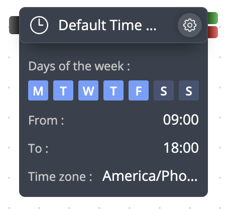
The below image shows the time-based module. An example of how you'd use this would be to attach a "phone number" module to the left, and then to the right, a cable to your mobile phone (green prong), and another cable to the voicemail module (red prong). Using this example the calls would go to voicemail on the weekends.

The Impact on Business Communications
The grid takes many by surprise - everyone is accustomed to menus, tick boxes, and drop-downs when "configuring" anything on the internet - the open canvas is somewhat refreshing. Some who were only interested in 1 menu and a voicemail end up with a much more complex setup, routing calls based on time or perhaps the caller-ID for example.
For more complex setups, check out our guides on:
- Customizing caller ID for effective management
- Setting up virtual phone systems
- Understanding call forwarding
TLDR: Using an [digital] open canvas to configure a company's (or individuals') call logic is simple and easy. (compared to the alternatives)
image credit goes to Kelly